
Introduction
This update brings several improvements designed to enhance your development process, user experience, and app performance. Key upgrades include enhancements to Cupertino widgets, Material widgets, and Impeller improvements, which are among the major changes to the engine, framework, and ecosystem. Let’s check out notable and new updates in more detail.
Material Widget Updates
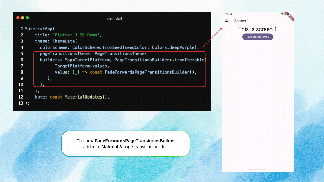
New Page Transition Builder
- New
FadeForwardsPageTransitionsBuilderadded in the Material 3 (M3) page transition builders. This transition matches Android's latest transition behaviour. - In this new transition builder, incoming pages slide and fade in from right to left, while outgoing pages slide out simultaneously but fade out similarly.
- This new transition also solves the performance issue previously caused by the
ZoomPageTransitionsBuildertransition.
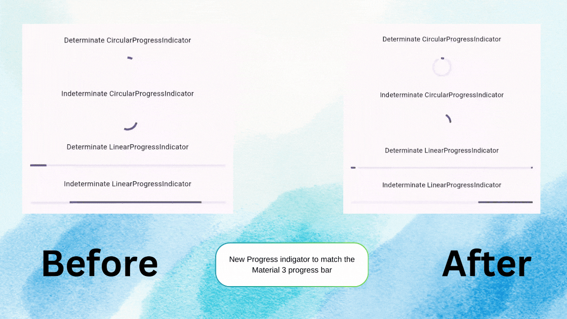
Progress Indicators Update
LinearProgressIndicatorandCircularProgressIndicatorare updated to align with Material Desing 3 specifications. To apply new styles, setyear2023to false inProgressIndicatorThemeData- A few other properties were also added to
ProgressIndicatorThemeDatato customize the ProgressIndicator appearance. These properties are:borderRadius, stopindicatorColor, stopIndicatorRadius, strokeWidth, strokeAlign, strokeCap, constraints, trackGap, circular TrackPadding
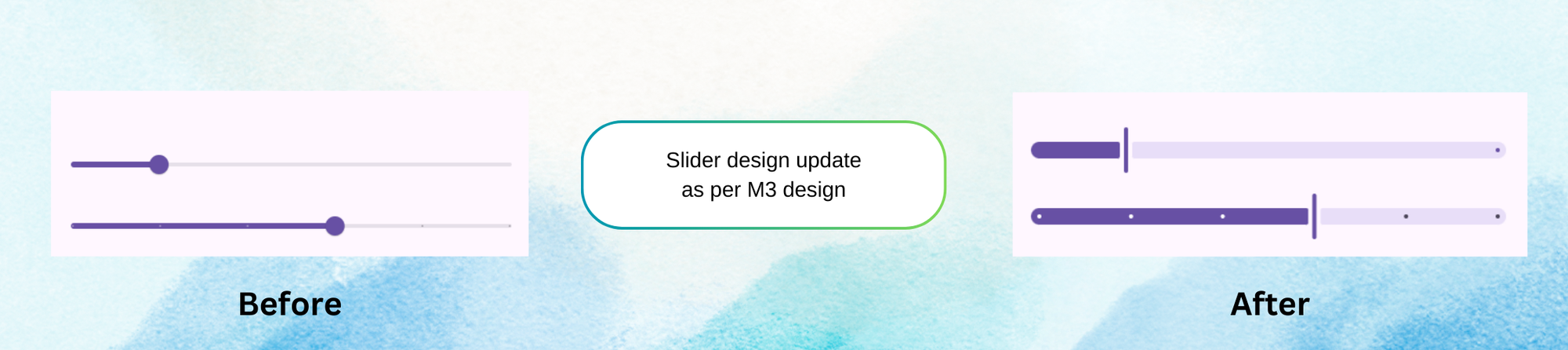
Slider Design Update
- The
Sliderhas also been updated to match the Material 3 Design specifications. - The Material 3 Design specs for the
Sliderwere updated in December 2023. To opt into the 2024 design spec, set theSlider.year2023flag tofalseinSliderThemeData
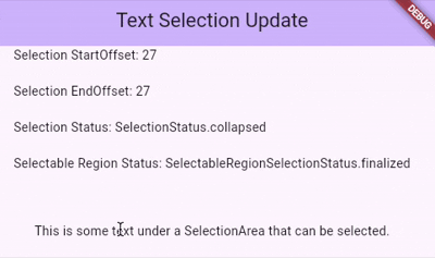
Text selection
SelectionListenerandSelectionListenerNotifiernow provide more detailed selection information withinSelectionAreaandSelectableRegion, such as start and end offsets. It also provides the status of whether selection exists or collapsed.- To check the status of text selection in the UI, you can use the
SelectableRegionSelectionStatusScopeinherited widget. It helps determine whether a parentSelectionAreaorSelectableRegionis actively changing or has completed its selection by callingSelectableRegionSelectionStatusScope.maybeOf(context)and checking theSelectableRegionSelectionStatus.
Material Library Enhancements
This update includes several bug fixes and feature enhancements for the Material Libray. Fixes and improvements include:
- Correct triggering of
DropdownMenu.onSelectedcallback through keyboard navigation. - Enhanced TabBar elastic tab animation
- Improved RangeSlider thumb animations, alignment with divisions, corners, and thumb padding.
- New
mouseCursorproperly introduced forChip,Tooltip, andReorderableListfor customizable hover effects.
Cupertino Widget Updates
Navigation bar Updates
Before Flutter 3.29 Cupertino navigation supported only the leading widget, trailing, and title widget, But what if you want to show the search field or segmented control below the navigation bar?
This problem is solved in this flutter release. Now CupertinoNavigationBar and CupertinoSliverNavigationBar accept a bottom Widget.
- This bottom widget can be configured with an additional property
bottomModeavailable inCupertinoSliverNavigationBar. This property configures the visibility of the bottom widget during scroll action, either auto-resizing until hidden withNavigationBarBottomMode.automaticor always visible withNavigationBarBottomMode.always.
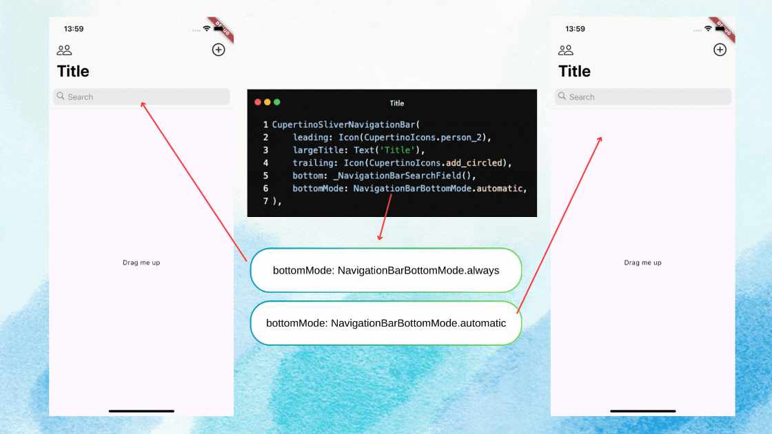
CupertinoSliverNavigationBarSnaps between expanded and collapsed states when partially scrolled.- A new constructor CupertinoNavigationBar.large is added to allow the static navigation bar for large titles.
UI Enhancement
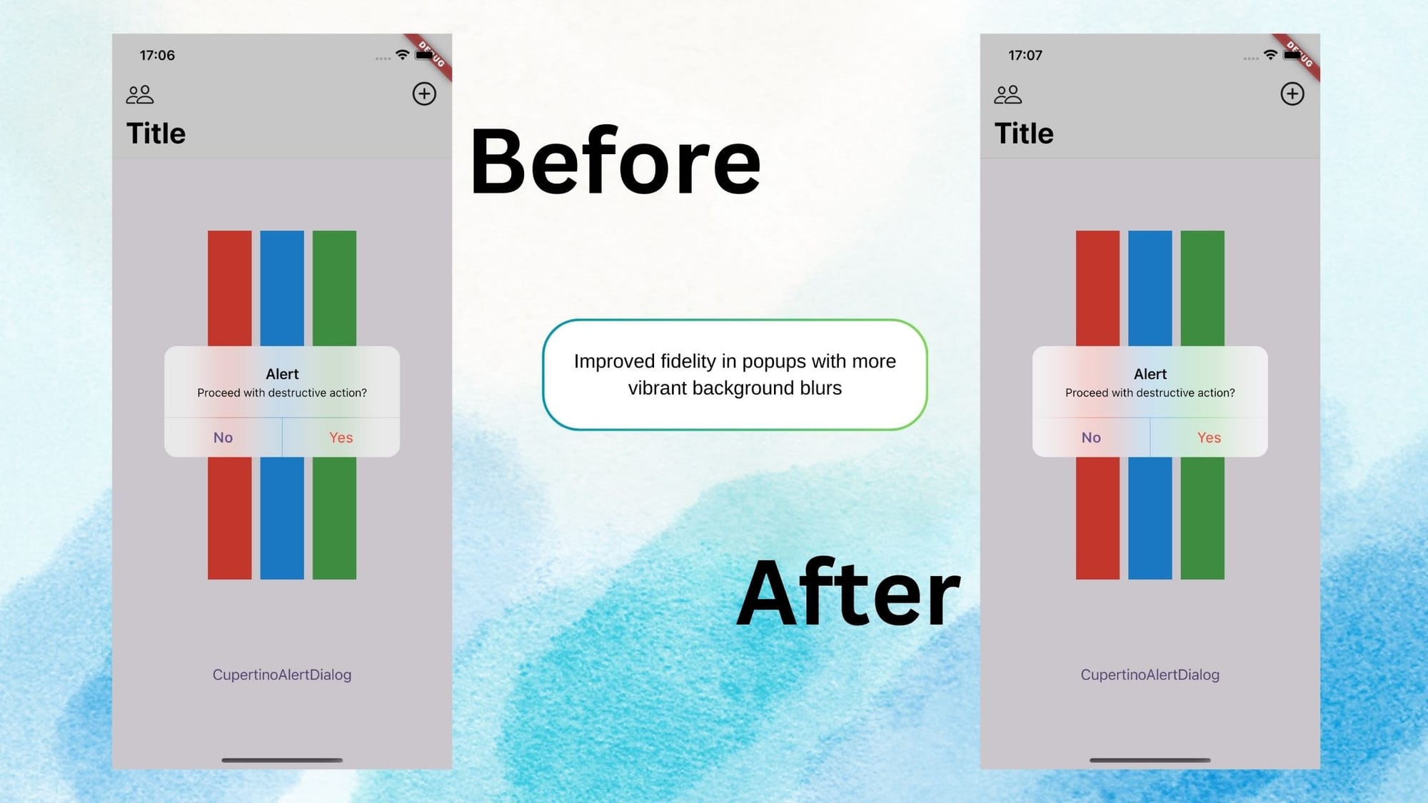
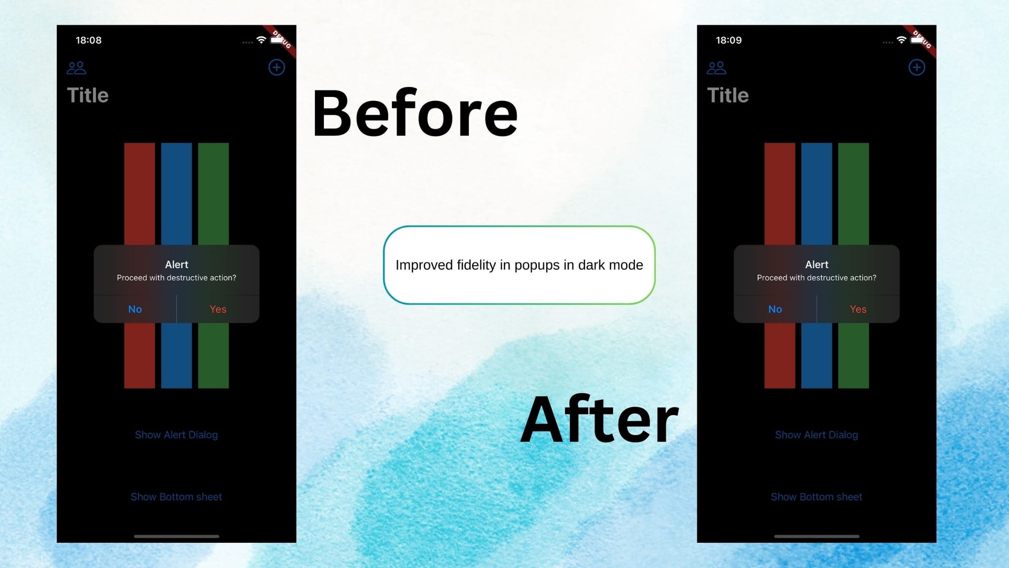
- Cupertino popups now show more vibrant background blurs to improve the native fidelity.
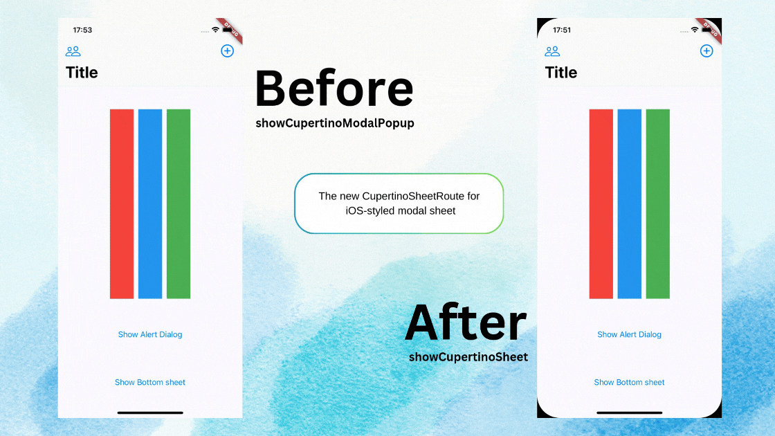
New Cupertino Model Sheet
- Flutter 3.29.0 introduced an iOS-styled model that supports drag-to-dismiss gestures. This new bottom sheet can be pushed on the screen using the code below
Navigator.of(context).push(
    CupertinoSheetRoute<void>(
        builder: (BuildContext context) => const _SheetScaffold(),
    ),
);- iOS-styled model can be used to display nested navigation setup using
showCupertinoSheet
CupertinoButton.filled(
  onPressed: () {
    showCupertinoSheet<void>(
      context: context,
      useNestedNavigation: true,
      pageBuilder: (BuildContext context) => const _SheetScaffold(),
    );
  },
  child: const Text('Push Another Sheet'),
),
iOS Text Selection Updates
- Text selection handles inverted their order when inverted.
- The border color of the text selection magnifier aligns with the current theme.
Text Selection update
Flutter Engine Updates
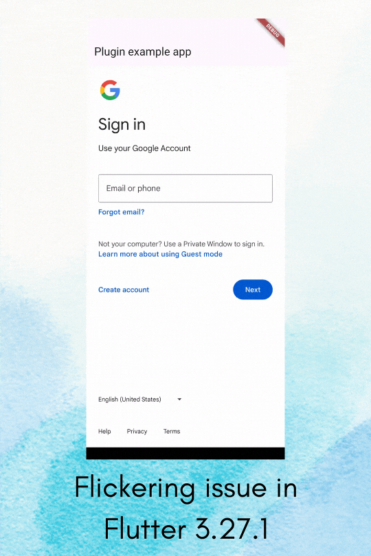
- Impeller Valkan Stability Improvement:
- There are the corrections and the performance improvement on the basis of that flutter 3.27 beta release the fixes they did in the Impeller are the flickering and the visual jitters on the older Vaulkan capable devices.
- Now they also disable the Android hardware buffer swapchains and this feature is placed behind a featured flag.
- Also addressed were the black screen and the crashes on the MediaTek and the PowerVR devices caused by disabling Vulkan. These devices now use only Impeller OpenGLES.
- Android Emulators have been updated to use the Impeller GLES backend for increased stability.
- Impeller OpenGLES - Impeller OpenGLES supports fallback for the Non-Vulkan devices in version 3.29. Android devices with functional Vulkan devices will automatically use the Impeller and the OpenGLES instead of Skia, and they also have Universal compatibility to ensure 100% support for the flutter on Android devices.
- Impeller on iOS - In the iOS backend update Skia has been removed, and the
FLTEnableImpelleropt-out flag no longer works. iOS now uses Impeller only. Further binary size reductions are expected in future releases as we begin to remove Skia components from iOS builds. - New features Leveraging the impeller. This contains some new features that take advantage of the impeller backend.
- Backdrop filter optimizations - Applications that display multiple backdrop filters can now use the new widget
BackdropGroupApplications and newBackdropFilter.groupedconstructor. These can improve the performance of multiple blurs above and beyond what was possible on the Skia backend. - ImageFilter.shader - A new
ImageFilterconstructor allows you to apply a custom shader to any child widget. This offers functionality similar to theAnimatedSamplerwidget from thepackage:flutter_shaderspackage but with the added benefit of also working with backdrop filters.
- Backdrop filter optimizations - Applications that display multiple backdrop filters can now use the new widget
- Threading Changes on Android/iOS
Previously, Flutter executed Dart code on a separate UI thread from the platform’s main thread. This architecture allowed higher theoretical throughput when both the platform and UI threads were occupied.However, it required serialized and asynchronous message passing for most platform interop. This design also impacted areas like text input, accessibility, and plugins.
Starting with Flutter 3.29, Dart code is executed on the application’s main thread for Android and iOS. There is no longer a separate UI thread, marking a significant shift.This change is the first step in a series of improvements aimed at enhancing platform interop on mobile platforms.
The update enables synchronous calls to and from the platform without the overhead of serialization and message passing.
Flutter Web Updates
WebAssembly Support Enhancements:
- Initial Release in May 2024: Required special HTTP response headers to host Flutter web applications using WebAssembly.
- Current Update: The requirement for special headers has been relaxed.
- With default headers: Runs with WebAssembly (wasm) but is limited to a single thread.
- With updated headers: Supports multi-threading, enhancing performance.
Improvements in WebGL Image Handling:
- Asynchronous image Decoding: Images are not decoded off the UI thread to prevent jank, improving the smoothness of animation and interactions.
- Enhanced Image Network Support:
Image.networkhas been updated to handle Cross-Origin Resource Sharing (CROS) images seamlessly, simplifying development with external images.
DevTools and IDEs Updates
New DevTools inspector
- By default, the new DevTools inspector is available to all users.
- New DevTools includes a more compact widget tree.
- A refreshed view for widget properties is now available.
- Users can enable automatic updates triggered by hot-reload and navigation events.
Changes to on-device widget selection:
Once widget selection mode is activated in the DevTools inspector, all selections on the device are treated as widget selections until you exit the mode. Previously, after selecting a widget, you had to click the on-device "Select widget" button to choose another. Now, there is an on-device button that allows you to quickly exit widget selection mode.
Breaking changes and deprecations
Discontinuing package support
Some flutter packages are planned to be discontinued by April 30th, 2025
- ios_platform_images
- css_colors
- palette_generator
- flutter_image
- flutter_adaptive_scaffold
- flutter_markdown
Removal of script-based application of the Flutter Gradle plugin
The script-based application of the Flutter Gradle plugin, deprecated since version 3.19, has been removed. This change supports transitioning the Flutter Gradle plugin from Groovy to Kotlin and migrating it to use AGP's public API, aiming to reduce breakages and build regressions with new AGP versions. Projects created before 3.16 that haven't migrated will be impacted. If you see the warning "You are applying Flutter’s main Gradle plugin imperatively" during a build, migration is required.
Material normalization
As part of the ongoing theme of normalization in Material, this release deprecates ThemeData.dialogBackgroundColor and replaces it with DialogThemeData.backgroundColor.
In addition, the ButtonStyleButton.iconAlignment property has been deprecated, as it is now part of ButtonStyle and the associated styleFrom methods.
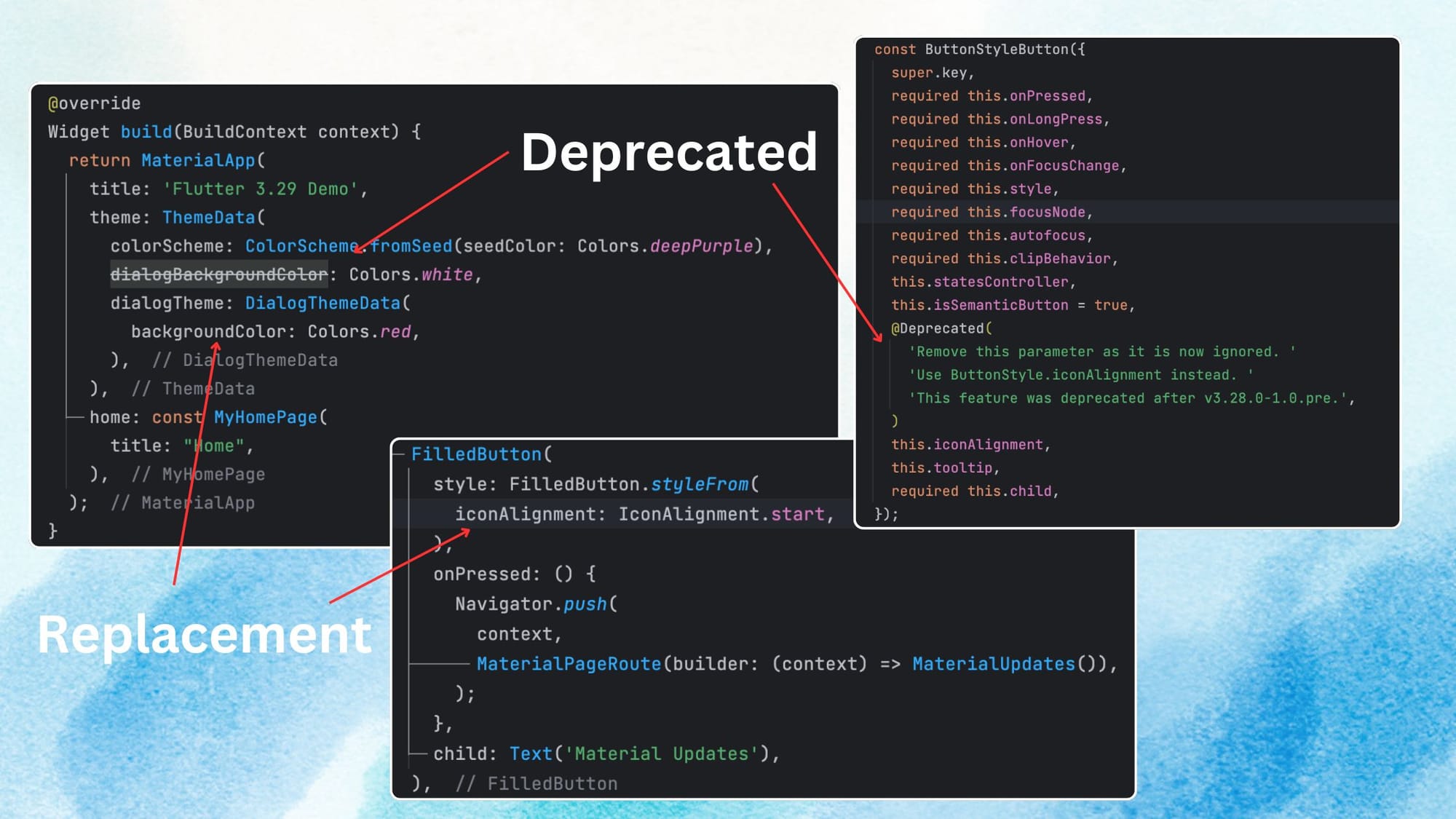
You can use the dart fix command to update your code accordingly.
For all breaking changes in this release, see the full list of migration guidance on the website's breaking changes page.
In summary, these changes are part of Flutter's continued efforts to improve consistency and simplify the framework. These updates help developers maintain code and ensure better long-term compatibility with future versions of Flutter.